

Most boards don't fail their assurance duties because someone hid a problem. They fail because the same risk shows up in three different formats, from three different owners, at three different committee meetings — and no one on the board can tell whether they're looking at overlapping coverage, redundant work, or a genuine gap sitting quietly in between.
This piece is about fixing that at the architecture level. Not by adding another report, but by building a canonical map that ties every material risk to an assurance owner, a committee, an evidence standard, and a review cadence. The goal is boring in the best way: any director should be able to pick a risk, ask "who assures this and how good is the evidence," and get a straight answer.
Why assurance fragments across almost every board
The fragmentation isn't a discipline problem. It's structural, and it compounds as the organization grows.
When a company is small, one CFO-plus-controller effectively is all three lines. They run the controls, they check them, and they tell the board. Crude, but coherent. As the business scales, functions specialize. You get a dedicated risk function, then compliance, then internal audit, then an ESG lead, then a security team with its own assurance narrative. Each develops its own vocabulary, its own scoring, its own reporting rhythm — and each maps to whichever committee sponsored it first.
-
Duplicate coverage nobody notices. Internal audit tests access controls in Q1. The security function reports on the same controls in Q2 using a maturity model. Both look fine. Neither realizes they tested different environments.
-
Orphaned risks. A risk sits on the register with a named owner, but no line of assurance actually validates the control. Everyone assumes someone else has it. This is the classic gap that surfaces only after an incident.
-
Evidence you can't compare. One function reports "amber," another reports "3.2 out of 5," a third writes a paragraph. The board can't rank these against each other, so it defaults to trusting the presenter's tone.
That last one is the quiet killer. Assurance is only useful if it's comparable. If the board can't line up cyber assurance against financial-controls assurance against third-party-risk assurance and see them measured the same way, prioritization becomes guesswork dressed up as governance.
What breaks at scale
The failure modes get sharper as complexity increases, and they tend to arrive in a predictable order.
Eliminate boardroom chaos with seamless coordination.
Panlly simplifies scheduling, collaboration, and follow-ups for every board meeting.
- Centralized meeting scheduling
- Secure document sharing
- Task assignment & tracking
No credit card required
First, committee overload masks the gaps. As more risks emerge, committees absorb more material. The audit committee, which in a mid-sized company might have owned financial reporting and internal audit, quietly becomes the dumping ground for cyber, data privacy, and half of ESG because nobody else has room. The agenda swells and depth collapses. Directors skim. This is closely tied to how a weak audit pack can invite restatements when the committee can't actually interrogate what it's being handed — the same dynamic applies to assurance broadly, not just financials.
Second, the risk register and the committee agendas drift apart. The register is maintained by the risk function on one schedule. Committee agendas are set by chairs and the corporate secretary on another. Six months in, material risks on the register have never appeared on any agenda, and items being discussed don't map to any registered risk. If you've already worked through mapping the risk register to board agendas, tolerances, and escalation triggers, you know how fast that alignment decays without a maintained crosswalk.
Third, evidence quality becomes invisible. At small scale, a director can eyeball a control report and sense whether it's rigorous. At scale, the board receives dozens of assurance artifacts per cycle. Nobody can assess the quality of each — whether it was based on a full population test or a sample of five, whether it covered the current quarter or last year's snapshot. The board starts assuring itself against assurance it hasn't actually evaluated.
Fourth, deep-dives become reactive. Instead of a planned rotation where each major risk domain gets serious annual examination, deep-dives happen only when something has already gone wrong. That's not oversight — that's post-mortems with a governance label.
The core artifact: a risk-to-assurance owner matrix
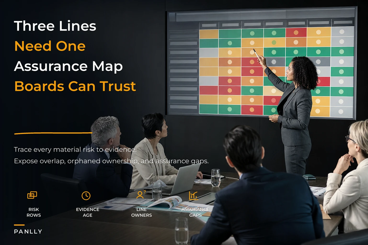
The fix starts with one canonical document that everything else hangs off. Call it the assurance map. Its job is to force every material risk into a single grid where the three lines are explicit and comparable.
At minimum, each row ties a risk to its first-line owner, its second-line monitor, its third-line assurer, the committee that receives it, the evidence standard expected, and the last time it was independently tested.
| Risk domain | 1st line (owns/controls) | 2nd line (monitors) | 3rd line (assures) | Owning committee | Evidence standard | Last independent test |
|---|---|---|---|---|---|---|
| Financial reporting controls | Controller | Risk & compliance | Internal audit | Audit | Full-population reconciliation + sample test | Q1 |
| Cyber / access controls | CISO | Security governance | Internal audit / external pen test | Audit (or Risk) | Independent pen test + control-operating evidence | Q3 |
| Third-party / vendor risk | Procurement lead | Compliance | Internal audit | Risk | Sampled contract + SLA review | None in 18 mo ⚠ |
| ESG / emissions data | Sustainability lead | Risk & compliance | External limited assurance | Risk / full board | External assurance opinion | Annual |
| Regulatory compliance | GC / compliance | Compliance | Internal audit | Audit / Risk | Regulatory change log + control test | Q2 |
The value isn't the table itself — it's what it exposes. The moment you populate it honestly, the orphaned risks light up. The "None in 18 months" cell in that third-party row is exactly the kind of finding that never surfaces in a normal deck, because no single report is supposed to mention what hasn't been done. The matrix makes absence visible.
A simple visual showing how the map ties risks to assurance lines and committees can make the relationships and gaps obvious to non-technical directors.
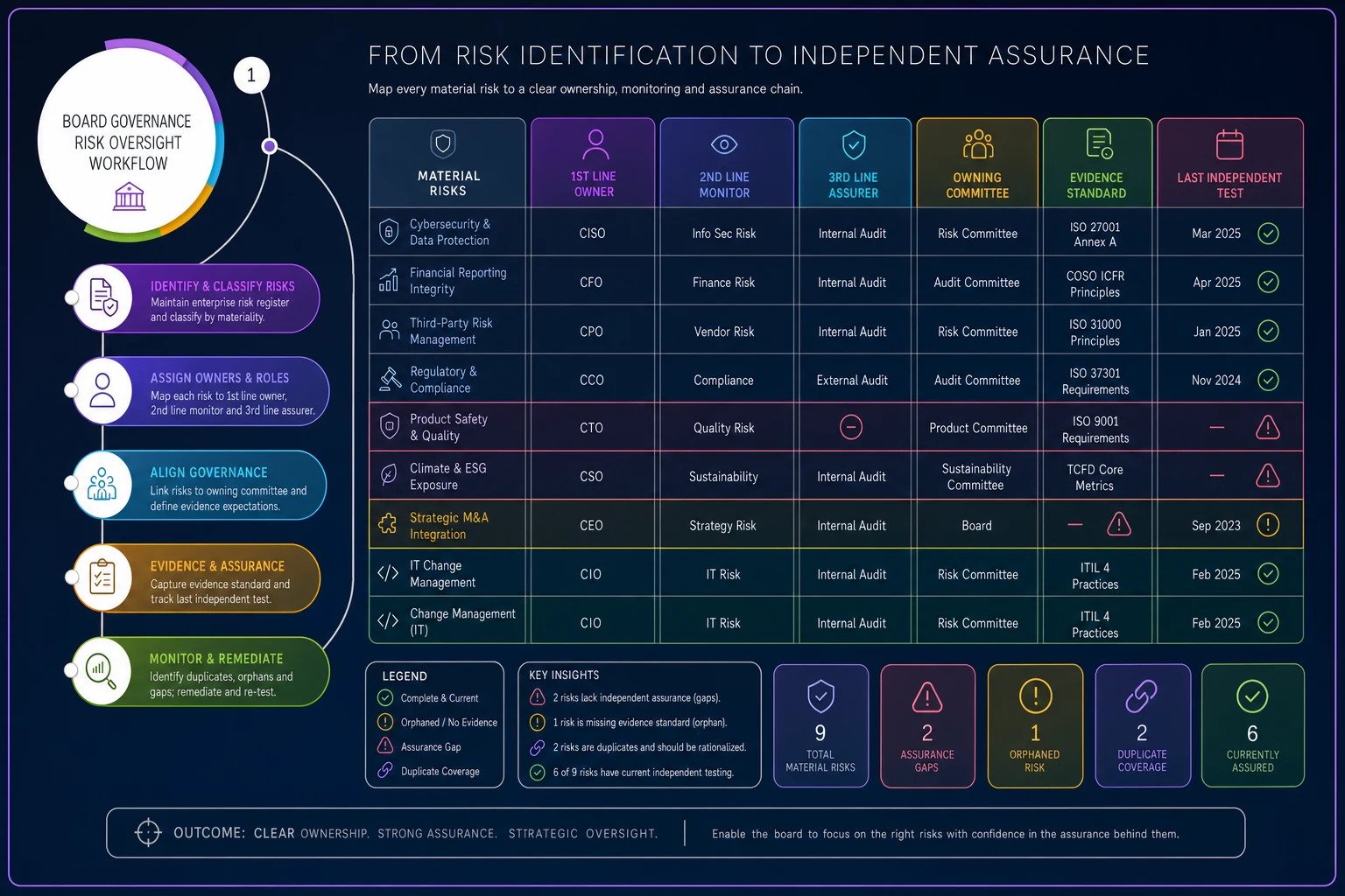
A note from real practice: the first time an organization builds this, expect the third-line column to have holes. Internal audit rarely covers everything, and that's fine — the point of the map is to make the board choose where independent assurance is genuinely needed, rather than assuming it exists everywhere.
Evidence comparators: making "assured" mean the same thing everywhere
A map that shows who assures each risk still doesn't tell the board whether the assurance is any good. That's what evidence comparators are for — a shared standard for grading assurance strength so a "strong" rating on cyber means roughly the same thing as a "strong" rating on financial controls.
A workable comparator scale usually has four levels:
-
Independent, tested, current — an independent party tested the control against a full or statistically valid sample within the current cycle. Highest confidence.
-
Independent, but dated or sampled narrowly — assurance exists but is either months old or based on a thin sample.
-
Self-attested with review — the function reports on itself; a second line has reviewed the report but not re-tested.
-
Self-attested only — management says it's fine. That's the entire evidence base.
The discipline this creates is subtle but powerful. A domain rated "green" on the heat map but sitting at comparator level 4 is not actually green — it's unverified. When the board starts asking "green on what evidence?", presenters can no longer smuggle self-assessment through as assurance. In practice, this single reframing changes how functions prepare, because nobody wants to walk into a committee with a level-4 evidence base on a high-severity risk.
This is also where assurance connects to disclosure integrity. For domains like ESG, the comparator level directly shapes what you can credibly say publicly — which is why avoiding ESG oversight failures depends on getting assurance cadences and evidence standards right before the reporting deadline forces your hand.
Committee brief standards and deliverable templates
Once the map and comparators exist, reporting has to conform to them — or the whole thing decays back into free-form decks within two cycles. That means standardizing what a committee brief must contain.
A minimum committee brief standard for any assurance item should carry:
-
The risk domain and its current severity/tolerance status
-
The three assurance lines named, with the specific evidence behind each
-
The comparator level for the current cycle, and whether it moved since last time
-
Any gap, exception, or unremediated finding — stated plainly, not buried
-
What the committee is being asked to do
note, challenge, escalate, or approve
The corporate secretary should enforce the brief standard by returning non-conforming submissions rather than letting them into committee packs.
The template matters more than it sounds. When every function submits assurance in the same structure, the committee can read across them in minutes and spot the outlier — the one domain where the comparator level dropped, or where the "ask" is "note" when it obviously should be "escalate." Free-form reporting hides outliers by making everything look different. Standard templates make outliers jump off the page.
The corporate secretary's role here is architectural, not clerical. Someone has to own the map, enforce the brief standard, and refuse submissions that don't meet it. Without a single owner, the standard erodes the first time a senior executive submits a nine-slide narrative instead of a one-page brief and nobody sends it back.
The deep-dive schedule: rotating serious examination
The last piece is time. Comparators and briefs give you breadth every cycle. Deep-dives give you depth on a rotation, so no domain goes years without genuine scrutiny.
A periodic deep-dive schedule assigns each major risk domain a slot across the year where it gets extended committee time, the full evidence base rather than a summary, and often a direct session with the assurance provider. A practical rotation for a mid-sized board might look like:
-
Q1 — Financial reporting and controls deep-dive (aligned to year-end and audit).
-
Q2 — Cyber and technology resilience, including the latest independent testing.
-
Q3 — Third-party, supply chain, and operational risk.
-
Q4 — ESG, regulatory, and emerging-risk horizon scan.
The schedule should be published a year ahead and protected. The failure pattern here is that deep-dives are the first thing sacrificed when the agenda gets crowded — and the domain that gets bumped is invariably the one that later becomes the crisis. Treating the rotation as fixed, the way you'd treat a statutory filing deadline, is what keeps oversight proactive rather than forensic.
One useful refinement: let comparator levels drive the rotation. If a domain has been sitting at level 3 or 4 for two cycles, it jumps the queue. The schedule provides the baseline; evidence quality decides the exceptions.
Where this makes sense — and where it's overkill
This architecture is worth building when the organization has genuinely separated its lines of assurance — distinct risk, compliance, and audit functions — and when the board is receiving assurance from more sources than any one director can reasonably hold in their head. That's usually somewhere north of a few hundred employees, or any regulated entity regardless of size.
It's overkill for a small company where the CFO still functions as all three lines. Forcing a five-domain deep-dive rotation onto a fifteen-person business creates governance theater — impressive-looking artifacts that consume more effort than the risks warrant. In that setting, a single quarterly risk conversation with honest self-assessment is more useful than a formal comparator scale.
It's also the wrong move if the board won't enforce it. A half-implemented assurance map is arguably worse than none, because it creates the appearance of comprehensive coverage while the holes stay hidden inside a professional-looking grid. If leadership isn't prepared to have someone reject non-conforming briefs and protect the deep-dive calendar, don't start.
A real scenario
Consider a regional financial-services firm — roughly 600 staff — with a board that had an audit committee and a risk committee that had grown up independently. Cyber assurance went to audit. Third-party risk went to risk. ESG floated between them depending on who had agenda room. Nobody had ever laid the domains side by side.
When they built the assurance map for the first time, two things surfaced within a week. Vendor risk hadn't had any independent testing in roughly a year and a half — it was sitting at self-attested only, comparator level 4, while showing "amber-stable" on every heat map. And cyber was being assured twice, once by internal audit and once by the security function, using different scopes that between them still missed the firm's cloud environment.
The fix wasn't dramatic. They assigned each domain a single owning committee, adopted the four-level comparator, and published a four-slot deep-dive schedule. The following cycle, committee packs shrank because the standardized briefs cut the narrative padding, and the vendor-risk gap went onto internal audit's plan for the next quarter. Nothing exploded — which was rather the point. The value was that a director could finally answer "how do we know" for any material risk without a scramble.
Making the map hold together over time
The hardest part isn't building the assurance map. It's keeping it accurate as risks shift, owners change roles, and functions reorganize. A static grid in a slide deck is out of date within a quarter. The organizations that keep this working treat the map as a living record — one place where the risk register, the assurance owners, the comparator ratings, and the committee routing stay reconciled, and where a change in one propagates to the others.
That maintenance burden is exactly where governance platforms earn their place: keeping the crosswalk between risks, owners, evidence, and committees current, flagging domains whose comparator level has slipped or whose deep-dive is overdue, and giving the corporate secretary a single source rather than a folder of reconciled-by-hand spreadsheets. The point isn't the tooling — it's that the map only delivers value if it stays accurate, and manual reconciliation across functions is precisely the thing that fails first at scale.
Get the architecture right and the three lines stop being a compliance diagram on a slide. They become something a board can actually use: a way to look at any risk, see who assures it and how strong that assurance is, and know — with evidence you could line up side by side — whether the answer is good enough.
Ready to enhance your board's productivity?
Join 500+ organizations using Panlly to save time, improve governance, and streamline board operations.